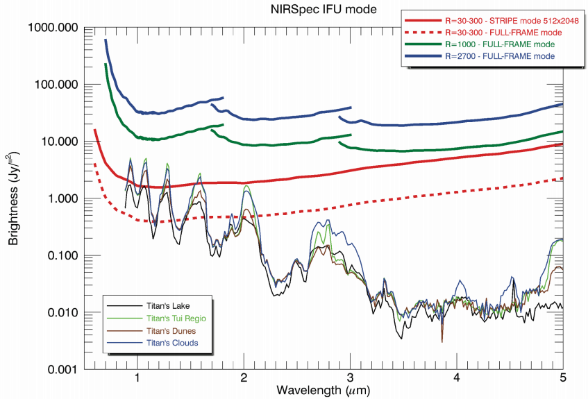
While reading this paper about the possibilities JWST will provide to study Titan, I have come across a graph that plots brightness (not sure what units it is in) against wavelength in micron. Here it is:

The description of the graph says: "Titan NIR spectrum for various terrain types based on Cassini VIMS data. Shown above are the saturation thresholds for various slit (top) and IFU (bottom) observing modes of NIRSpec, showing that low spectral resolution modes will saturate the detectors around 1 μm and up to 2 μm for standard frame readout times."
From what I understand, this graph is supposed to show what the NIRSpec instrument on top of the JWST can help us see regarding the chemical composition of Titan's surface. However, when I am looking in the graph I do not understand what exactly I am seeing.
Could anyone with more knowledge about this type of graphs explain what exactly do I see in this plot? For example, I would like to know what is the meaning of the sentence "Shorter wavelengths will likely saturate NIRSpec, especially at lower resolutions" (taken from this slideshow, where it appeared next to the graph) with regard to this graph, as well as other conclusions that can be drawn from it.