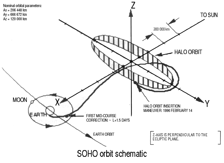
I've been enjoying the JPL Horizons web interface and after I discovered the incredibly extensive database associated with SOHO (Solar and Heliospheric Observatory, also see sohowww.nascom.nasa.gov) for this answer I decided to learn more about the satellite's orbit.
I exported a dataset of historical (and projected) orbit data for SOHO Spacecraft in 1 day steps using the following setup:
I also exported the positions of the Sun, and of the Earth-Moon Barycenter the same way.
Using the reduced mass of the Sun vs Earth-Moon Barycenter (EMB) system as:
$$\mu = \frac{m_{earth}+m_{moon}}{m_{sun}+m_{earth}+m_{moon}}$$
I used the equations of motion in a rotating frame, and solved numerically for zero acceleration along the EMB-sun line (y, z set to zero):
$$ r_1=\sqrt{(x+\mu)^2} $$
$$ r_2=\sqrt{(x-1+\mu)^2} $$
$$ \ddot x=x-\frac{(1-\mu)(x+\mu)}{{r_1}^3}-\frac{\mu(x-1+\mu)}{{r_2}^3} $$
I found a zero at x = 0.989986 which is about 99% of the distance from the Sun-EMB Barycenter (basically the Sun) to the EMB, or about 1.5 million km from the earth towards the sun.
So I made a point and called it $L_1$ and defined it as this location, so as the EMB slowly moves closer and farther from the sun over the year, my $L_1$ 'origin' will breath with it.
Finally, I un-rotated the position so that the Sun-EMB line stayed fixed with the sun on the left, so that it looks like the standard configuration for CR3BP problems.
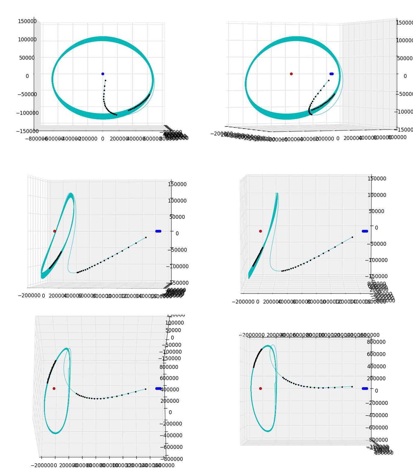
I got a pretty nice looking trajectory! The plot isn't breathtaking - limitations of Matplotlib and the (overly-)restrictive SE 2MB limit for GIFs.
Note, x, y, and z scales are all different - this is plotted at the moment just to fit into a cube. The blob (red) on the left in the middle of the orbit is $L_1$ as defined above, and the little cigar-shaped blob (blue) on the right represents the motion of the EMB in this particular frame. I did look at a plot with EMB-fixed instead of $L_1$, but the orbit became thicker. This way is really better looking, as you'd expect. The little black dots are the first and last 20 days (data points) in the extracted dataset.
If you look closely at the "top" there's a little blip, and excursion toward the sun. I think this is the famous, frightening episode in June to November 1998 when SOHO was almost lost. There is a page of recovery docs or you can read about it in Aerospace America May 1999: Saving SOHO or the article by ESA's F.C. Vandenbussche SOHO’s Recovery – An Unprecedented Success Story or for more of the technical details; Roberts 2002 The SOHO Mission L1 Halo Orbit Recovery From the Attitude Control Anomalies of 1998.
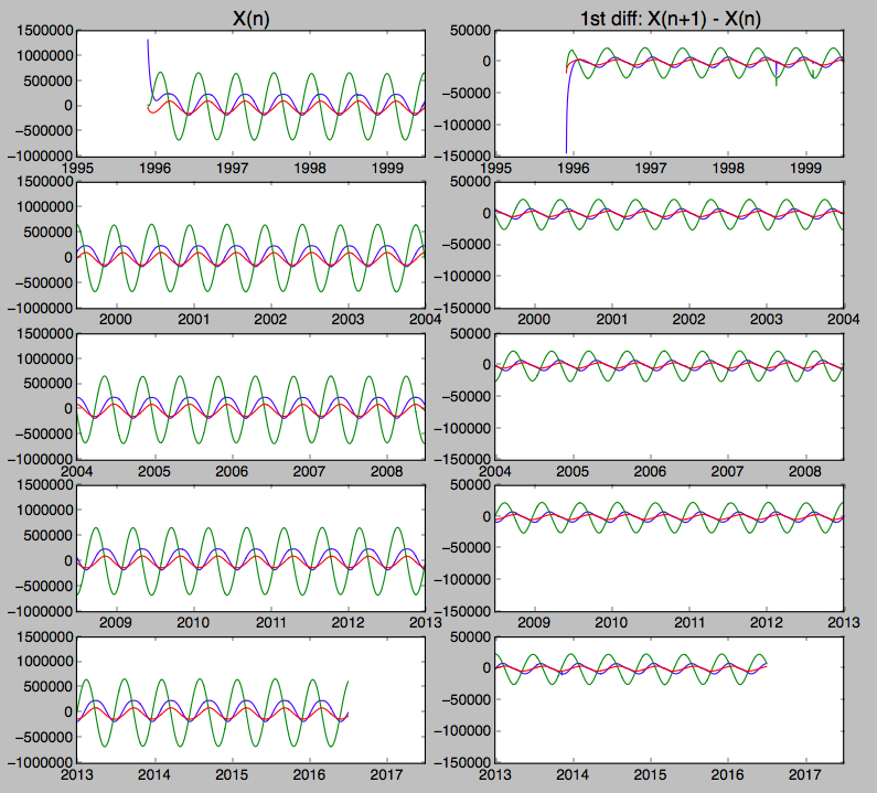
I wanted to see if I could find the event, and other stationkeeping maneuvers in the raw data. So, just to see what happened, I plotted the variation of x, y and z in my coordinates over the interval 3-dec-1996 to 4-jul-2016, which is all Horizons would give me on the day I downloaded it. Apparently it propagates the state vector a few weeks into the future.
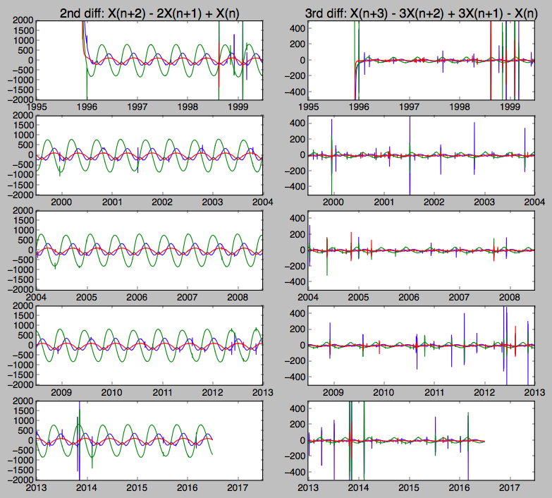
To look for maneuvers, I plotted the first, second and third finite difference - a numerical way of approximating derivatives. Here's what I got:
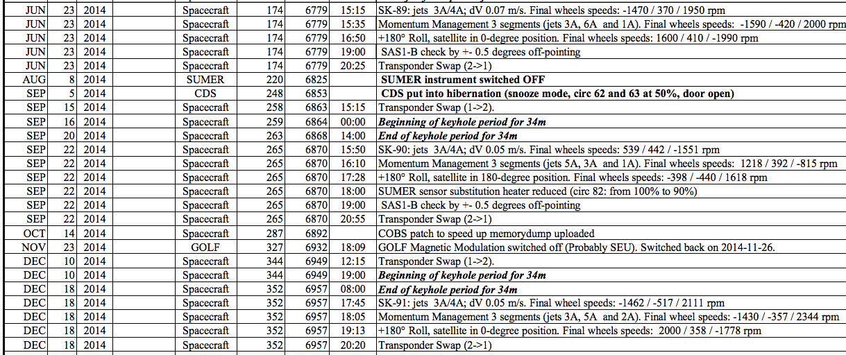
In the 2nd and 3rd difference plots, the approximately harmonic motion nearly disappears, and discontinuities become prominent. I was assuming the data was showing me station keeping (SK) maneuvers. I noticed a big zig-zag around mid-October 2014. I found SOHO-Spacecraft-Events.pdf but strangely there are no propulsive maneuvers listed around that time.
click to enlarge:
So my question is: are these zig-zags (and in particular, the one around October 15, 2014) just stitching errors in the reconstructed data, or did a particle of dark matter collide with a Higgs boson and SOHO can report the first observation? (humor).
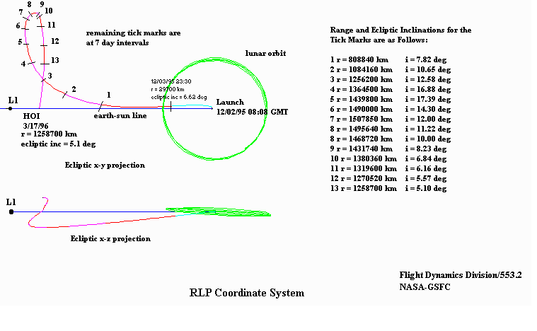
These are also from the sohowww.nascom.nasa.gov site:

