15
$\begingroup$

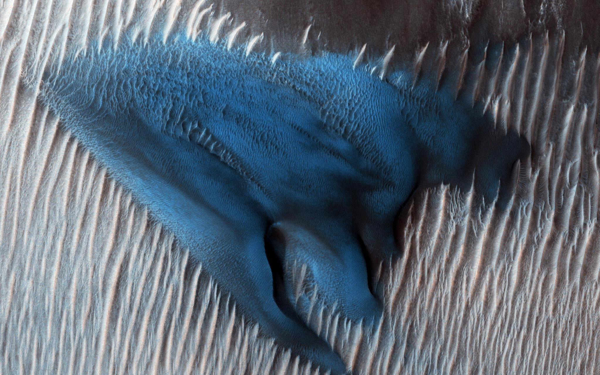
NASA recently released an image of a blue dune on Mars. The accompanying story seems to suggest to me that it is a false color image - some property of that part of the image is detected and rendered in blue simply to make it stand out, rather than actually appearing blue in natural light (true color).

What is really going on here? What makes it blue? What is known (or theorized) about that dune to make it a noteworthy feature?

Image pia22512 found here:

Mars "Blue Dune" pia22512

$\endgroup$

6 Answers 6

9
$\begingroup$

It is actually surprisingly difficult to determine the color of something so small on Mars. In order to best understand that, we need to understand a bit more about HiRISE, and more about human vision.

The HiRISE Camera consists of 14 push broom type sensors (Video mine), 10 of them red that are side by side, and two pairs in the center strip that cover two bands, one that covers blue/green, and the second that covers near infra-red.

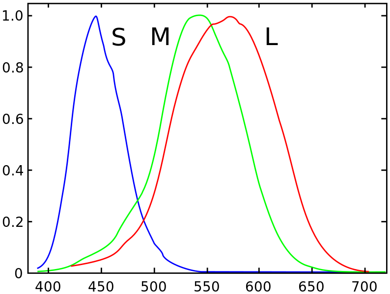
Human vision primarily consists of sensors that receive 3 bands. The red and green closely overlap, limiting the ability to see between the two colors. A typical response curve for a human's vision to color can be seen below.

enter image description here

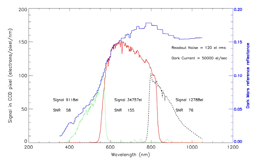
HIRISE produces two color products by standard, one that uses the 3 color channels normally seen as Red, Blue, and Green as Red, Blue/Green, and Near Infrared. They also produce something similar using only the two colors and interpolating the color to give 3 colors. None of these are quite what humans can see, but they are close. For comparison, here is the HiRISE Spectral resolution, as seen in this paper.

enter image description here

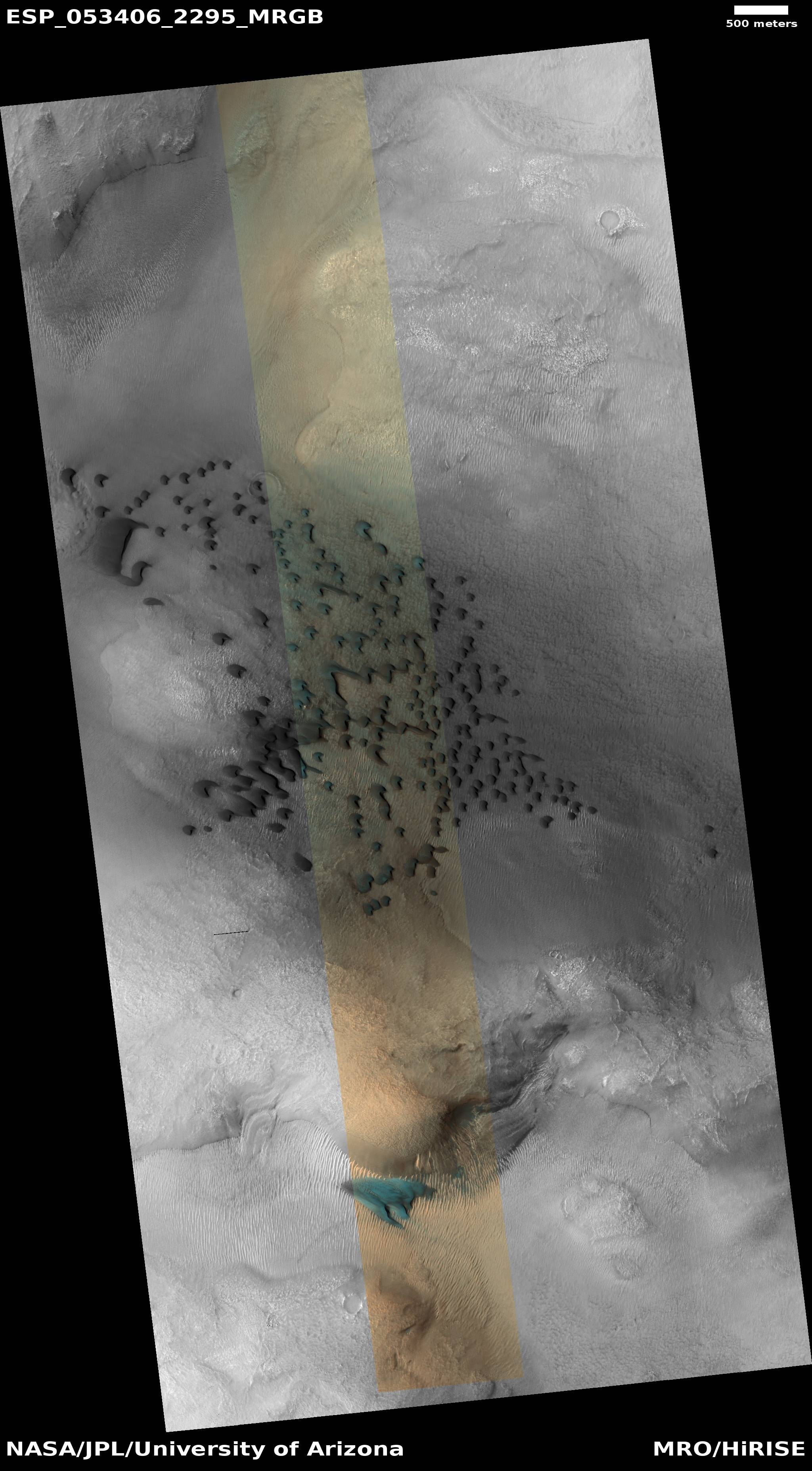
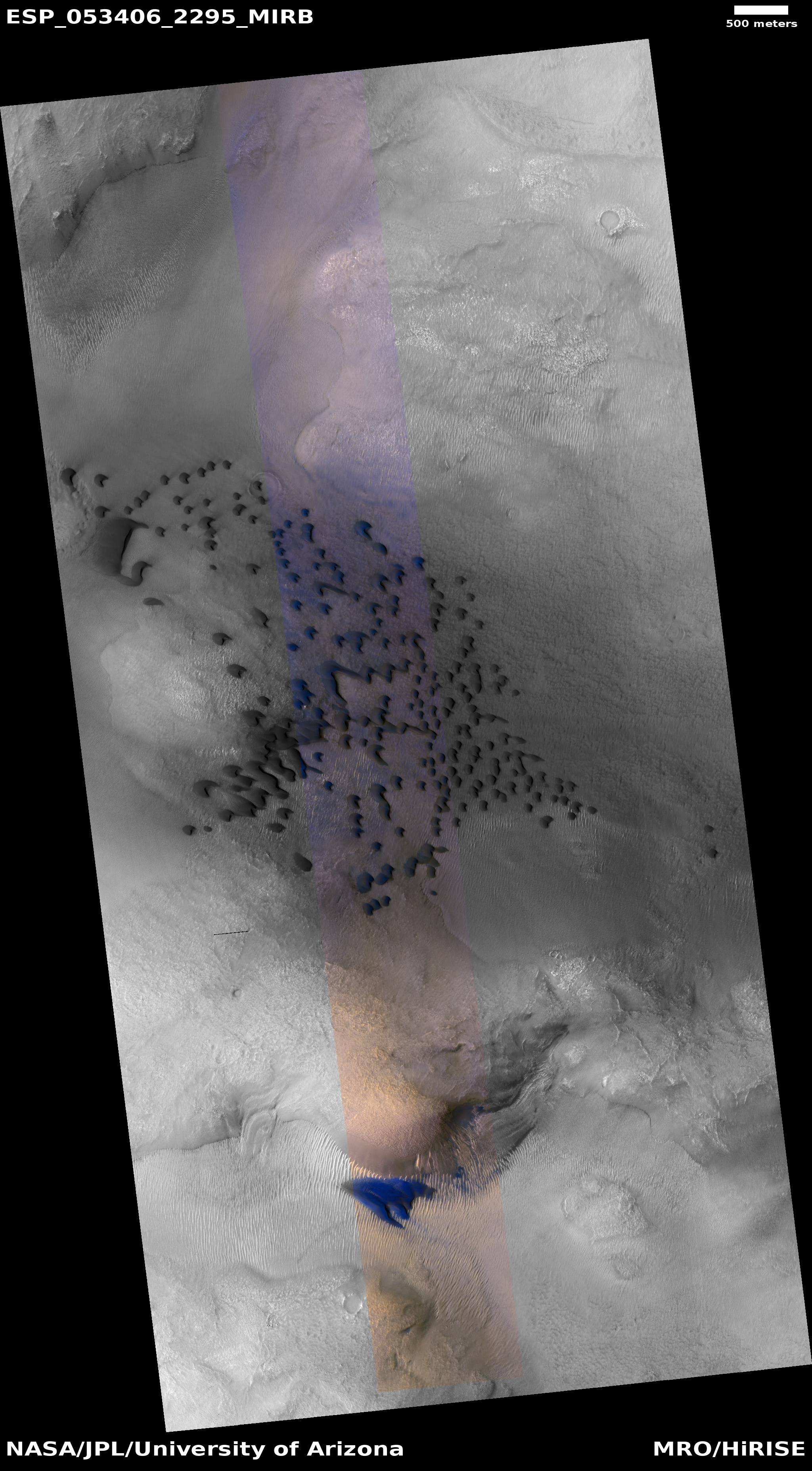
Let's look at the two image types that HiRISE provides by standard for that image.

Blue-Green and Red

Blue-Green, Red, and Near IR

What we really can tell is that whatever the dune is, it peaks in the Blue/Green band of HiRISE. From the specs, that primarily means 400-600 nm. That really does show the peak of both Blue and Green in human vision. One could infer that it is probably more blue then green, peaking around 500 nm, due to the fact that the red channel appears to be very low, based on the fact that the combined image appears very blue.

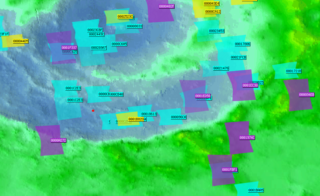
The truth is, using HiRISE it isn't possible to know if it is blue or green, but it probably tends towards the blue. The one instrument that might work is CRISM, but it seems like it hasn't imaged that exact spot, which is approximately where the red dot is in this image.

enter image description here

$\endgroup$
3
  • 1
    $\begingroup$ I answered the first bit of the question, is it blue. The answer is it is either blue or green, probably leaning towards blue. I don't know what the answer is to the second part, quite frankly. $\endgroup$
    – PearsonArtPhoto
    Commented Jun 26, 2018 at 1:27
  • $\begingroup$ The red channel must be almost completely 0. The likely peak is 500 nm, to be in the range of the channel and not overlapping the red. Purple is also a likely color, although it would have to be very strongly purple. But it is virtually impossible to say without a more detailed image. And for something that relatively small, there aren't many choices in Mars orbit. $\endgroup$
    – PearsonArtPhoto
    Commented Jun 26, 2018 at 2:22
  • $\begingroup$ Since it is not blue I'm glad to see that “…but it probably tends towards the blue.” has been replaced with a more thorough examination. $\endgroup$
    – uhoh
    Commented Jun 27, 2018 at 0:48
5
$\begingroup$

Part 1, "is it actually blue?"

This is a HiRISE image. On the page linked to by your source page, there is a heading 'About color products (PDF)'.

This is the one you're looking for:

PSP_005000_1000_RGB.NOMAP.JP2 3-color image consisting of RED, BG, and synthetic blue images. The BG image has been warped to line up with the RED.NOMAP image. The BG (blue-green) bandpass primarily accepts green light. The synthetic blue image digital numbers (DNs) consist of the BG image DN multiplied by 2 minus 30% of the RED image DN for each pixel. This is not unique data, but provides a more appealing way to display the color variations present in just two bandpasses, RED and BG.

(emphasis mine)

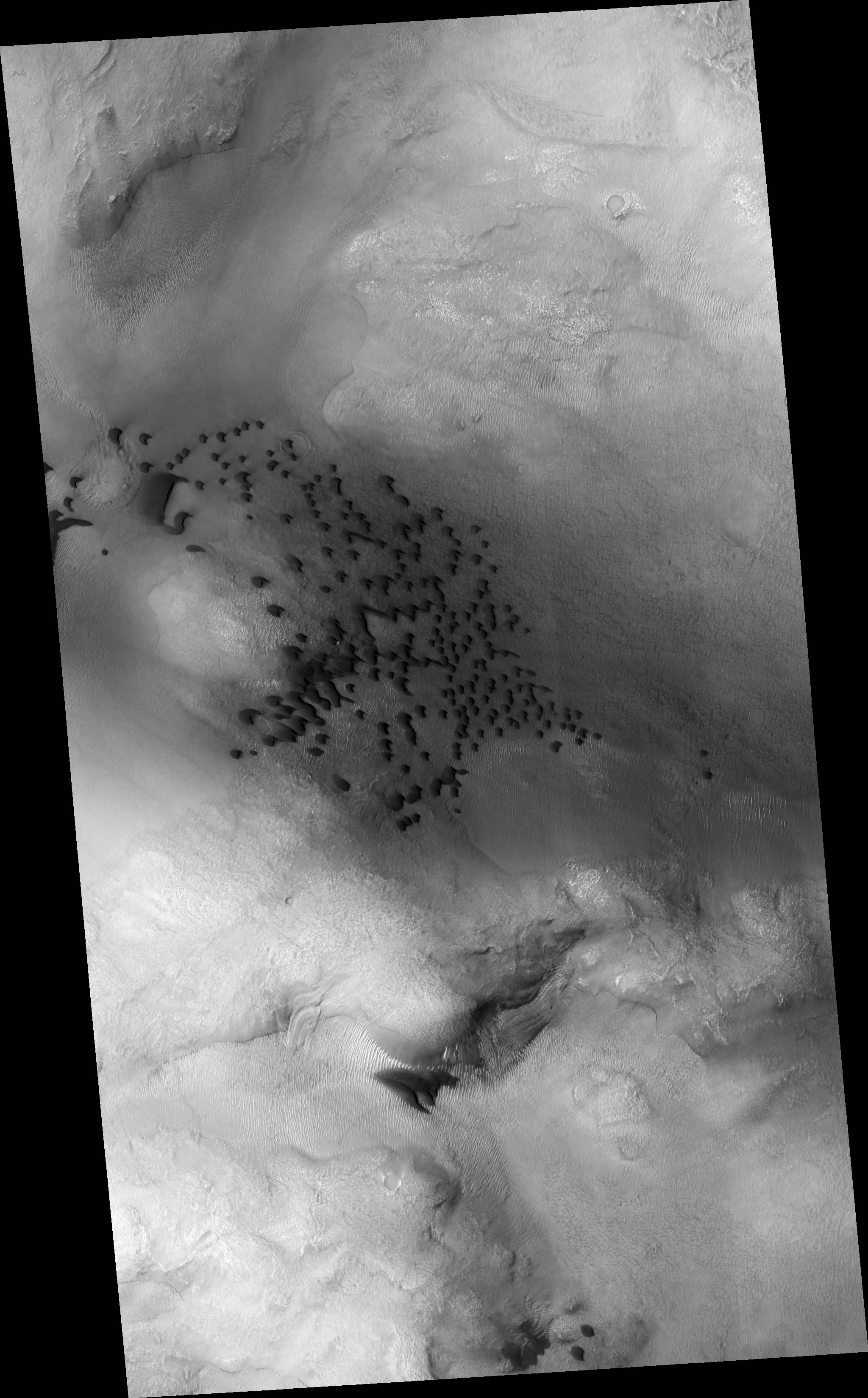
So yes, the colors in this image have been modified. Here is an unmodified version. Note that HiRISE is not a full-color camera, so this isn't representative for what the human eye would see either.

dunes appear black here

Part 2, why are those dunes so dark?

I found a study of dark dunes on Mars. It doesn't mention the dunes in this photo specifically, but it has looked at similar dunes.

Spectral analysis shows these dunes contain mostly olivine and pyroxene minerals.

The compositional mixture of unweathered pyroxenes and olivines formerly reported by many authors was confirmed by spectral analysis.

Olivine and pyroxene minerals, detected as the major components of the dark material, might be indicative of a volcanic origin analogues to Earth. Furthermore, these minerals must have been protected during times of active fluvial processes on Mars; otherwise, they would have been altered by chemical weathering. Morphological aspects of the dark layers found in several craters disclose that they were buried after deposition and later exposed by impact erosion.

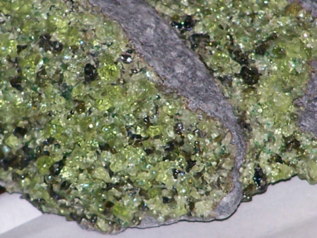
Here's an example of those minerals. The green stuff is an olivine, the darker material is a pyroxene. Note that olivine and pyroxene are families, individual members may have different colors.

enter image description here

$\endgroup$
0
4
$\begingroup$

Picking up on PearsonArtPhoto great answer, I was intrigued by the assertion that what we saw in the image was mostly blue with almost no red channel.

So I wrote the following snippet of code, to analyze the following image https://www.nasa.gov/sites/default/files/thumbnails/image/pia22512.jpg, saved on my hard drive as "picture.jpg".

The output of the snippet is the following image, which shows the three RGB channel separated (first row), in grayscale (second row) and of a zoomed portion of the dune (third row): enter image description here Assuming that the downloaded image has inside a faithful representation of HiRISE data and assuming that I understood PearsonArtPhoto's answer correctly (i.e. that RED channel in the image would be the "RED" HiRISE signal, GREEN channel is the "Infrared" HiRISE signal and that the BLUE channel is the "BLUE/GREEN" HiRISE signal), then I would say that:
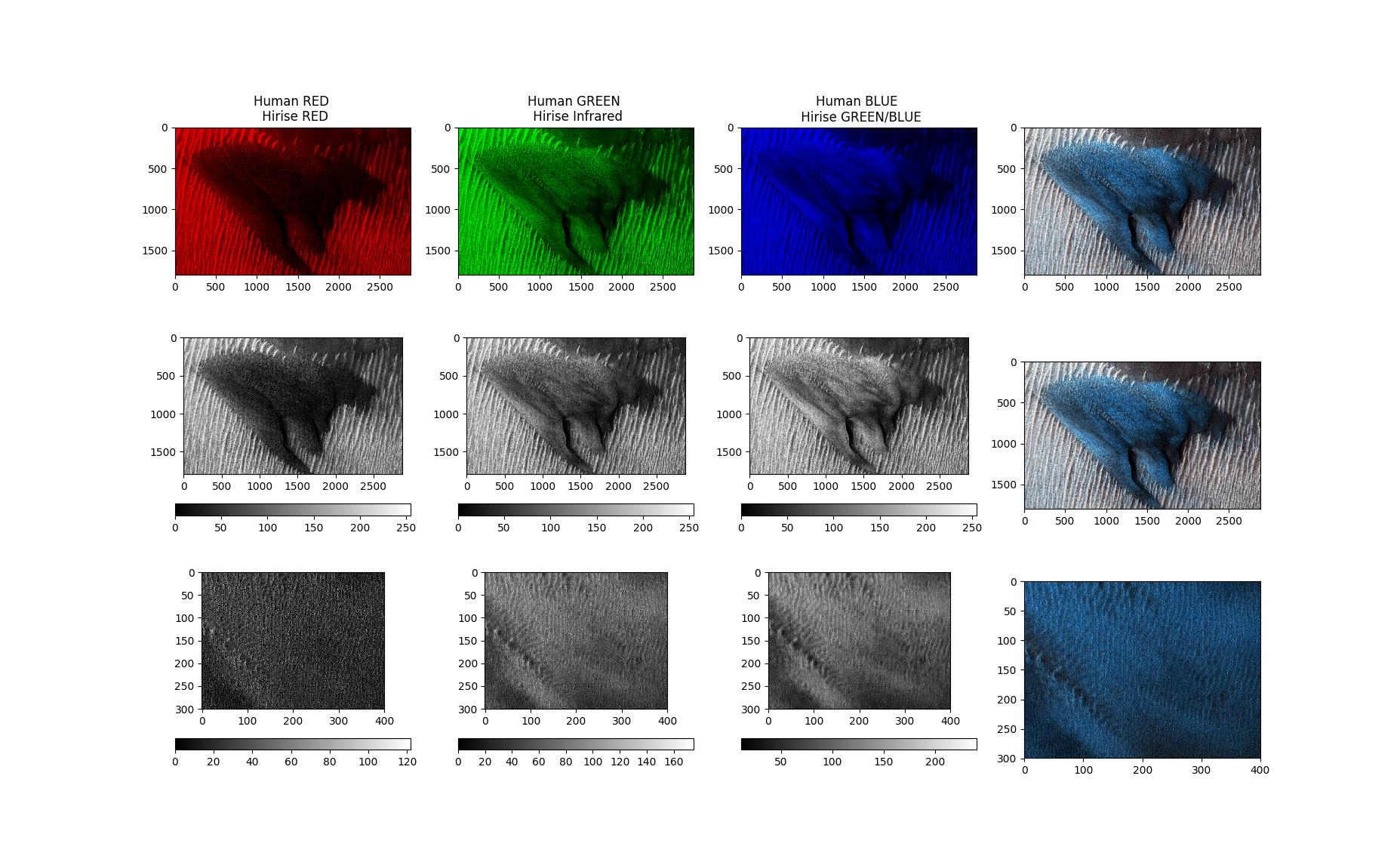
  1. there is a lot of infrared signal (wavelength > 750nm according to HiRise Spectral resolution graph) which as humans we would not see, so it does not affect the question if the dune is really blue to us or not. However, this reminds us that the dune probably doesn't emit a monochromatic color (i.e. a single wavelength) but it emits a combination of wavelengths.
  2. the blue/green signal is a lot active expected
  3. the red signal is perhaps not that low (it does not max out at 255 but still goes to 120).

If the red signal was zero, than we could conclude that the signal picked by the green/blue signal must be < 525nm, so it could be blue but also green (green is between 495 and 570nm https://en.wikipedia.org/wiki/Green).

On the other hand, if indeed that red is "significant" (not just some noise), then having green/blue+red HiRise signals tells us by the spectral resolution graph that we might be receiving a single wavelength between 525nm and 600nm so this would be almost certainly green!

However, I would also remind of the first point: it could be that the dune emits two (and more) wavelengths, one in the "blue/green only" signal part (< 525nm) and one in the "red only" signal part (between 600ns and 750nm more or less). I am not sure what would be the human perceived color in this case, I have still to think about it :)

from PIL import Image
import matplotlib.pyplot as plt
import numpy as np

jpgfile = Image.open("picture.jpg")
print(jpgfile.bits, jpgfile.size, jpgfile.format)


data_array = np.array(jpgfile)

nrow,ncol,_ = data_array.shape


fig, ax = plt.subplots(3,4)
labels = ['Human RED \n Hirise RED', 'Human GREEN \n Hirise Infrared', 'Human BLUE \n Hirise GREEN/BLUE']
for i in range(3):
    data = np.zeros((nrow,ncol,3),data_array.dtype)
    data[:,:,i] = data_array[:,:,i]
    im = ax[0,i].imshow(data)
    ax[0,i].set_title(labels[i])
ax[0,3].imshow(data_array)


for i in range(3):
    data = np.zeros((nrow,ncol),data_array.dtype)
    data[:,:] = data_array[:,:,i]
    im = ax[1,i].imshow(data,cmap='gray')
    fig.colorbar(im, ax=ax[1,i], orientation='horizontal')
    print(i,data.max(),data.min())
ax[1,3].imshow(data_array)


data_array = data_array[700:1000,1150:1550,:]
for i in range(3):
    data = np.zeros(data_array.shape[0:2],data_array.dtype)
    data[:,:] = data_array[:,:,i]
    im = ax[2,i].imshow(data,cmap='gray')
    fig.colorbar(im, ax=ax[2,i], orientation='horizontal')
    print(i,data.max(),data.min())
ax[2,3].imshow(data_array)


plt.show()
$\endgroup$
2
  • $\begingroup$ "Assuming that the downloaded image has inside a faithful representation of HiRISE data..." The line just above the image in the question says Image pia22512 found here and that links to the description that states this is an enhanced color image. This answer gives a good discussion of the enhancement process you'd have to walk back, except that the page in the first link also gives a link to the original image. static.uahirise.org/images/2018/details/cut/ESP_053894_2295.jpg $\endgroup$
    – uhoh
    Commented Jun 26, 2018 at 16:29
  • 1
    $\begingroup$ I think it's great by the way that you've included a python script as part of your answer. $\endgroup$
    – uhoh
    Commented Jun 27, 2018 at 3:23
4
$\begingroup$

Excerpt from Information for Scientific Users of HiRISE Color Products by Alfred McEwen and Eric Eliason, October 10, 2007:

What do the colors in HiRISE images mean?

The PDS products are stretched differently from the products in the Extras directory. The PDS-product color is given the same minimum and maximum value, in calibrated units of reflectance (I/F), for each color bandpass. The result is that the colors are relatively bland, but they are also consistent from place to place on Mars. (The PDS label (.LBL file) provides the information for converting the DN value to I/F: I/F = DN*SCALING_FACTOR + OFFSET.) It isn't natural color, as seen by normal human eyes, because the IR, RED, and BG channels are displayed in red, green, and blue colors. For the Extras products, each color band is individually stretched to maximize contrast, so the colors are enhanced differently for each image based on the color and brightness of each scene. Scenes with dark shadows and bright sunlit slopes or with both bright and dark materials are stretched less, so the colors are less enhanced than is the case over bland scenes.

In spite of the variable level of color enhancement for the Extras products, we can make some generalizations to better understand what the stretched color images are showing. Dust (or indurated dust) is generally the reddest material present and looks reddish in the RGB color and yellow in the IRB color. Coarser-grained materials (sand and rocks) are generally bluer (or sometimes purplish in IRB color) but also relatively dark, except where coated by dust. Frost and ice are also relatively blue, but bright, and often concentrated at the poles or on pole-facing slopes. Some bedrock is also relatively bright and blue, but not as much as frost or ice, and it has distinctive morphologies. The IR and RED bandpasses are often highly correlated so the IR provides little new information, and the RGB color does a better job of showing the RED vs. blue-green color variations by moving these differences into the warmer colors...

$\endgroup$
2
  • 1
    $\begingroup$ While this link may answer the question, it is better to include the essential parts of the answer here and provide the link for reference. Link-only answers can become invalid if the linked page changes. - From Review $\endgroup$ Commented Jun 18, 2019 at 16:34
  • $\begingroup$ @SteveLinton edited. $\endgroup$
    – uhoh
    Commented Jun 18, 2019 at 17:05
3
$\begingroup$

Is the “Mars blue dune” actually blue?

No, “The dunes are actually grey, but appear relatively blue after such a stretch because most of Mars is red.” (see below).

The false color generation is used to help differentiate various materials or distributions. However, the manipulations have also captured the internet's attention, resulting in headlines of; "Mesmerizing", "Stunning", "Mysterious" x 2

NASA Captures Mars' Mesmerizing Blue Sand Dune — But What ...
NASA discovers mysterious blue dune on Mars
Mysterious blue dune spotted on Mars 
Stunning NASA photo shows blue sand dune on Mars, the Red Planet

The Inverse article Here's the Story Behind the Mesmerizing Blue Sand Dune NASA Snapped on Mars does an excellent job of explaining the extent of the image manipulation:

Alfred McEwen, Ph.D., one of the scientists who run the High Resolution Imaging Science Experiment — HiRISE — camera that took this photo, explained to Inverse how this strange image came to be.

The big blue one, however, “appearing like turquoise blue in enhanced color, is made of finer material and/or has a different composition than the surrounding,” said NASA in a press release. McEwen, a planetary geologist and director of the Planetary Image Research Laboratory at the University of Arizona, explained the extent to which photo enhancement created the striking blue color in an email to Inverse.

“The images are given min-max stretches in each individual color image to increase contrast,” he says. “The dunes are actually grey, but appear relatively blue after such a stretch because most of Mars is red.”

In an article for the HiRISE website written in 2016, McEwan explained how the color enhancement process created the above photos.

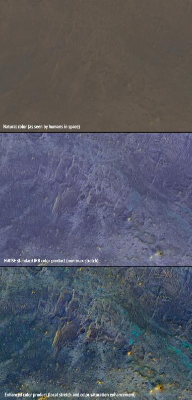
At the top is an approximation of the natural color as seen by people with normal color vision—almost no surface detail is visible. In the middle is the standard HiRISE IRB color product, consisting of the infrared, red, and blue-green images displayed as red, green, and blue, respectively, and with a min-max stretch applied to each color. In other words, the darkest pixel in the entire image is set to black, the brightest pixel is set to white, and all others are linearly interpolated. At bottom is an enhanced color product, in which each bandpass is given a linear stretch for the local subimage, sometimes saturating a small percentage of data to black or white to give the rest of the scene more contrast, followed by color saturation enhancement. Now we can see a diversity of colors that distinguish different surface units: dust, sand, and rocks with different minerals.

(emphasis added)

enter image description here


See also the CNN news item A large streak of 'blue' was found on the Red Planet.

$\endgroup$
8
  • $\begingroup$ OK, so the dune is only subtly different in color from its surroundings, due to some difference in structure or composition. Are there any facts or theories about what is actually different about that dune (e.g. chemical composition of the material there)? $\endgroup$
    – Anthony X
    Commented Jun 29, 2018 at 23:13
  • $\begingroup$ @AnthonyX ya this question is far from completely answered, but apart from this feature having been singled out for special "colorization" I don't know if that's any different than asking about any feature on Mars and asking why it is not exactly the same color as something right next to it. "Why isn't everything on Mars exactly the same color?" becomes a question with vanishing poignancy. $\endgroup$
    – uhoh
    Commented Jun 29, 2018 at 23:21
  • $\begingroup$ @AnthonyX would you mind accepting this answer? It is as comprehensive as currently possible and should be at the very top. $\endgroup$ Commented Jan 6, 2019 at 19:44
  • $\begingroup$ @EverydayAstronaut I would but for one thing not clearly explained: what is it about the feature that the (I presume) image processing algorithm is detecting in the image where the blue false coloring has been applied? Is it a specific level or range of brightness? texture? what? $\endgroup$
    – Anthony X
    Commented Jan 6, 2019 at 23:12
  • $\begingroup$ @AnthonyX I can't speak with certainty because I haven't done the processing, but after re-reading the quoted article all the way to the end, I believe that there is simply a very small "color" difference and that difference has been magnified dramatically. They just turned some color knobs up to "11". There's no mention of anything beyond that. $\endgroup$
    – uhoh
    Commented Jan 6, 2019 at 23:26
2
$\begingroup$

The referenced site states:

Just to the south of the group of barchan dunes is one large dune with a more complex structure. This particular dune, appearing like turquoise blue in enhanced color, is made of finer material and/or has a different composition than the surrounding.

$\endgroup$
2
  • 4
    $\begingroup$ This isn't a complete answer. "Enhanced color" means enhanced, and it may not be the same thing as "false color". Since they chose the term enhanced rather than false, the wording suggests it was somewhat blue but in the image it's bluer. The sentence "This particular dune...enhanced color" is linked in the article to this image of the dune, in what looks like more realistic color, and in which the dune also appears blue! but not as enhanced. $\endgroup$
    – uhoh
    Commented Jun 25, 2018 at 5:07
  • $\begingroup$ +1 incomplete but nonetheless right! $\endgroup$
    – uhoh
    Commented Jun 27, 2018 at 1:16

Your Answer

By clicking “Post Your Answer”, you agree to our terms of service and acknowledge you have read our privacy policy.

Not the answer you're looking for? Browse other questions tagged or ask your own question.